
This month’s column is inspired by James McCaffrey’s Test Run article K-Means++ Data Clustering, published in MSDN in August 2015. McCaffrey’s piece is really two articles rolled into one and is interesting not only for the data clustering algorithm that it presents but also for the fascinating light it sheds on the human facility to visually analyze data (not that McCaffrey comments on this point – it’s just there for the careful observer to note). But before getting to the more philosophical aspects, it’s necessary to discuss what K-means data clustering is all about.
To explain what data clustering entails, I will use the very same data the McCaffrey presents in his article as the test set for mine. He gives a set of ordered pairs of height (in inches) and weight (in pounds) for 20 people in some sampled population. The table listing these points
| Height (in) |
Weight (lbs) |
|---|---|
| 65.0 | 220.0 |
| 73.0 | 160.0 |
| 59.0 | 110.0 |
| 61.0 | 120.0 |
| 75.0 | 150.0 |
| 67.0 | 240.0 |
| 68.0 | 230.0 |
| 70.0 | 220.0 |
| 62.0 | 130.0 |
| 66.0 | 210.0 |
| 77.0 | 190.0 |
| 75.0 | 180.0 |
| 74.0 | 170.0 |
| 70.0 | 210.0 |
| 61.0 | 110.0 |
| 58.0 | 100.0 |
| 66.0 | 230.0 |
| 59.0 | 120.0 |
| 68.0 | 210.0 |
| 61.0 | 130.0 |
doesn’t reveal anything special at a glance; nor should it be expected that it would. As every good data scientist knows, the best (human) approach is to plot the data so that the eye can pick out patterns in that the mind may fail to perceive in the tabulated points. The resulting plot
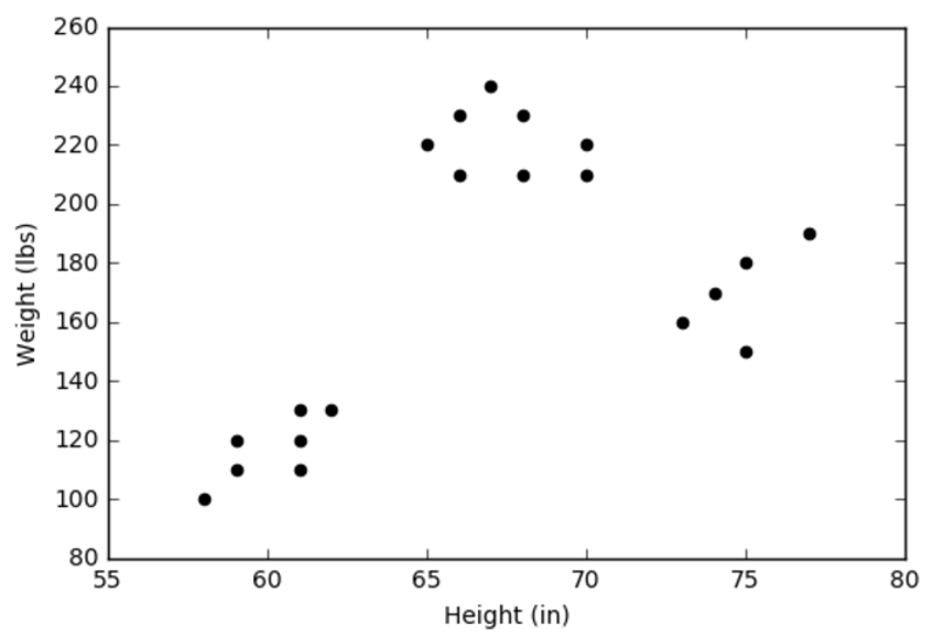
reveals that there are three distinct clusters for the data. McCaffrey doesn’t show a plot of these data but it seems that he omitted it because he wanted to focus on how to teach the computer to find these three groups using K-means clustering without the benefit of eyes and a brain, which it obvious doesn’t have.
The principle behind the K-means clustering is quite simple: each group of points is called a cluster if all the points are closer to the center of the group than they are to the centers of the of the other groups.
The implementation is a bit more difficult and tricky. Distance plays a key role in this algorithm but whereas the human eye can take in the entire plot at one go and can distinguish the center of each cluster intuitively, the computer must calculate each point one at a time. This leads to two problems: 1) how to numerically calculate distances between points and 2) how to find the centers of the cluster from which these distances are measured. Let’s deal with each of these.
The fact that the units for the x-axis are different from those on the y-axis can lead to some problems identifying the clusters – for both the human and the machine. Consider the following plot of the same data but with the x- and y-axes given the same extent from 50 to 200 in their respective units:
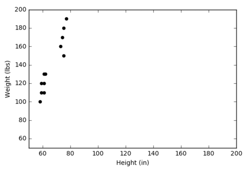
It isn’t at all clear that there are three distinct clusters as opposed to two. A better approach is to normalize the data in some fashion. I prefer using the Z-score where the data are normalized according to
\[ Z_x = \frac{ x – <x>}{\sigma_x} \; , \]
where $<x>$ is the mean over all the values and $\sigma_x$ is the corresponding standard deviation. Applying the normalization to the height and the weight gives
Once the data are normalized, the distance between them is determined by the usual Euclidean norm.
The second step is to determine the centers of each cluster, which is essentially a chicken-and-the-egg problem. On one hand, one needs the centers to determine which point belongs to which cluster. On the other hand, one needs to have the points clustered in order to find their center. The K-means approach is to guess the centers and then to iterate to find a self-consistent solution.
I implemented the K-means clustering code in a Jupyter notebook using Python 2.7 and numpy. I defined 2 helper functions.
The first one determined the cluster into which each point was classified based on the current guess of the centers. It loops are all points and compares each point’s distance from the k centers. The point belongs to the closest center and the point is assigned the id number closest center in a list, which is returned.
def find_cluster(curr_means,data):
    num_pts      = len(data)
    k            = len(curr_means)
    cluster_list = np.zeros(num_pts,dtype=int)
    dist         = np.zeros(k)
    for i in range(num_pts):
        for m in range(k):
            l       = data[i] - curr_means[m]
            dist[m] = l.dot(l)
        cluster_list[i] = np.argmin(dist)
    return cluster_list
The second helper function updates the position of the centers by selecting from the list of all points, those that belong to the current cluster. This function depends heavily on the slicing and numerical functions built into numpy.
def update_means(k,cluster_list,curr_data):
    updated_means = np.zeros((k,2))
    for i in range(k):
        clustered_data     = curr_data[np.where(cluster_list == i)]
        updated_means[i,:] = np.array([np.mean(clustered_data[:,0]),np.mean(clustered_data[:,1])])
    return updated_means
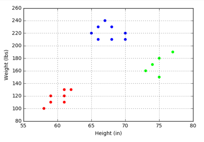
For this implementation, I chose 3 clusters (k = 3) and I seeded the guess for the centers by randomly selecting from the list of the initial points. Subsequent updates moved the centers off the tabulated points. The update process was iterated until no changes were observed in the position of the cluster centers. The final cluster assignments were then used to color code the points based on the cluster to which they belong.
The first run of the algorithm was successful with the resulting plot indicating that the process had done a good job of identifying the clusters similar to the way the human eye would.
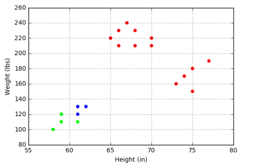
Subsequent runs show that about 70-80% of the time, the algorithm correctly identifies the clusters. The other 20-30% of the time, the algorithm gets ‘stuck’ and misidentifies the points in way that tends to split the small cluster in the bottom left into two pieces (although not always in the same way).
The ‘++’ nomenclature featured in McCaffrey’s article (K++-means clustering) refers to a more sophisticated way of selecting the initial cluster centers that minimizes the chances that the algorithm will get confused. This new type of seed and some numerical experiments with a larger data set (in both number of points and dimensionality) will be the subject of next month’s column.